


Colour palettes inspired by nature
Colour across creative disciplines

As we become more experienced in botanical and natural history illustration we soon develop our own colour palette, knowing which colours and pigments work best for the subjects we choose to paint. I have three colour palettes in watercolour, but tend to only use one of those most of the time. The other two consist of a range of granulating colours, which are very useful for landscapes and mixed media, and the other contains those colours that I do not need that often. They include unusual colours that can be difficult to mix and my favourite opaque pigments.
The one thing I have noticed as I work more in textile art and tapestry weaving is that I am creating my colour palettes in a very similar way. Grouping colours together, whether that be for individual works or how I store and categorise the materials I use.

The application of colour theory is completely transferrable, especially when deciding what colours to place next to each other; colour balance across a textile/weaving piece; or deciding what colours to explore when starting a piece of work. As I move more into creating textile art and weavings, I am incredibly grateful that my past experiences with colour can feed into this new area of exploration.
Colour mixing can take a bit of getting used to when it comes to tapestry weaving and quite often it is about optical mixing, which is when the perception of color results from the combination of adjacent colors. This can especially be the case when you are working to achieve a transparent visual effect. Some yarns that you use for this type of weaving can be blended together, for example you can have 6 different strands combined, with each strand being a different colour, if you so wish. More about that in another post I expect!
Anyway, I thought I would share some images of colour palettes from pieces of work created over the last year and show you where the inspiration came from.

Silver birch bark. In early 2024 we visited RSPB Arne Nature Reserve in Dorset. There was an area of birch woodland on a circular walk and being winter, the bark of the trees was on full show, with no interruption from leaves and foliage. The colours were so subtle and I wanted to explore how this and the textures could be replicated in yarn. I had a selection of rug yarns, and another textured yarn that I thought would work well for depicting the lenticels. I also wanted to have a go at eccentric weaving. Eccentric weaving is a weaving technique that involves weaving wefts at an angle to the warp, instead of at right angles. Therefore, the weaving was curving in my example rather than being straight. It seemed to work well and this weaving is a practice piece, very much like you would create a sketch in a sketchbook, but with this it will go into my samples box.
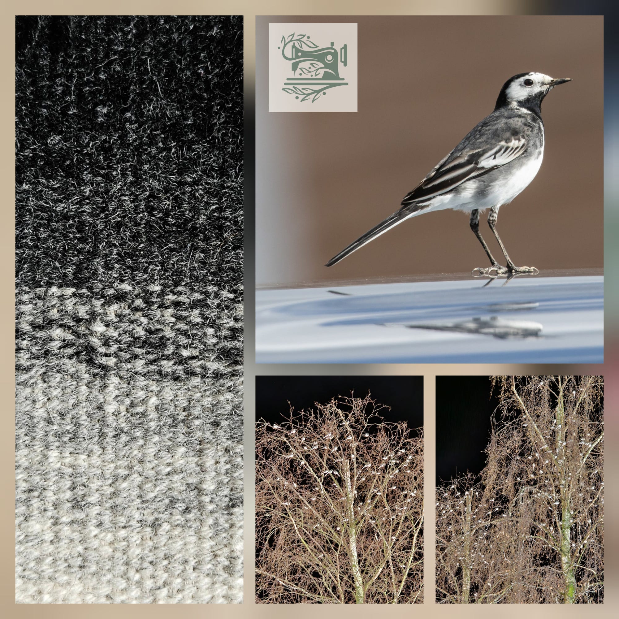
The weaving above was from the early stages of my tapestry weaving adventure. Just like we would when using graphite pencil or pen and ink, one of the first skills to acquire was being able to interpret and depict tonal values. This was achieved by blending a range of grey and white yarns. Fast forward to early January this year, and we were at our local shopping centre one evening. I could hear some beautiful bird sounds, and looked up to see numerous Pied wagtails coming into roost. Apparently it is quite common for them to make use of trees in shopping areas where there are also numerous buildings and lighting, all helping to keep the air temperature higher than in more rural areas. So my thoughts were that this weaving is the perfect representation of the plumage colour of the Pied wagtail.

Last year I visited the Unravel Festival and came across the Border Mill and the yarn that they process. I enjoyed weaving some samples from the yarn I purchased and later in the year I found out that they produced their own palette boxes. Each one based on the colours of the Scottish landscape. This really appealed to me and I was blown away by the variety of colours. I received one as a Christmas gift and fell in love with the colours in this box. It is 4-ply yarn and seems to weave very well (not all yarn is suitable of tapestry weaving). I was able to blend some of the colours as I wove the tapestry above. So in a similar way to being beguiled by paint colours, I now find myself doing this with yarn! The yarn from another of their palette boxes will hopefully be part of my next tapestry weaving project, which is still in the planning stages. (This is not an ad, just purely my own opinions).

The last colour palette I am going to share with you consists of yarn from the South Downs. The South Downs National Park is near where I live and stretches from Winchester in Hampshire, right across to East Sussex. This yarn can even be traced back to the flock that the fleece originated from. I ordered some samples and again the colours were perfect for my tastes and reflected the colours in the landscape so well. They particularly reminded me of the autumn and my visits to the woodlands of the New Forest National Park, at that time of year.
I had previously pressed some fronds of bracken and sealed them onto a piece of handmade paper using acrylic matte medium. I started to weave practicing the hatching technique and then placed the bracken collage between the warps.
I loved working on this, but alas I felt that the yarn was too soft for using in a larger piece of tapestry weaving. It had the feel of a double knit yarn and was very soft. Therefore it ‘packed down’ a lot which made the individual elements of the weave less obvious.
I hope that you enjoyed this latest post. My apologies it has taken some time to publish this, I hope to post more regularly this year. The days are gradually getting longer and soon Spring will be upon us. New life emerging in what is a troubling world at the moment and my intention in writing on this platform is to share the joys of the natural world and how they interact with our creative lives, hopefully giving some respite from the turmoil.
Other news
For those of you interested in my illustration work and teaching, details of this year’s workshops and courses can be found at: www.illustratingnaturesdetails.com
I have two online courses coming up. ILLUSTRATING TWIGS & BUDS IN EARLY SPRING takes place in March and MARVELLOUS MOTHS MATTER - Illustrating Moths in Pen & Ink takes place at the end of March and into April.
Thank you for including me in your subscriber list, Sarah. Good article. Rayma Peterson